Quantity and quality in CS research
The other day I ran across this ranking of computer science research institutions worldwide. It includes academic, private sector and government entities combined. What’s nice about it is that it includes a measure of quantity – publications – and one of quality – citations. This got me wondering about three questions:
First, does publication output exhibit diminishing citation returns in computer science? If it did, it would mean that researchers at the most prolific institutions have both the incentives and the support to write a lot, and in the process they churn out a lot of forgettable, seldom-cited stuff. If it did not, it would mean that the most prolific places are pretty good at quality control: people there write a lot, but whether because they’re smart in the first place or because they have an active seminar circuit, what makes it into publications is usually good, often-cited stuff.
Second, how evenly are the goods spread across the field? Are the top PhD programs doing all the publishing and getting all the citations, or is there good work being done and getting notice at lesser-ranked places too? In the latter case, if you’re thinking about grad school it won’t be a waste of your time to get your education at one of the more modest state schools.
Third, if you could come up with a quantitative answer to the previous question, would you expect it to be different between the sciences and the humanities? There’s a subset of labor economics research that’s been trying to figure out whether education really builds human capital (teaches you things) or it just certifies it (e.g., if you went to Harvard we know you’re smart and we don’t care what you did there). The evidence so far suggests that it does a bit of both. Some of us suspect that sciences do a little more building and a little less certifying, and in humanities it’s the other way around. If we’re right, then we should see that in the sciences the publications and citations are more evenly spread across the research institutions than they are in the humanities. To settle this question we would need a standardized measure of output inequality. The Gini coefficient, suggested below, is such a measure.
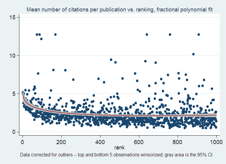
As far as I can tell from this data set, in CS the answer to the first question is that publications show increasing citation returns. If you take the ratio of citations to publications you can show pretty dramatically that the most productive schools are also cited the most, with the mean citations per publication dropping from about 5 to about 2 within the first 400 ranked institutions, and staying there for the remaining 600. However, there is a fair amount of variation about this mean. In other words, the superstars of the field are sprinkled all over the top 1,000 institutions, which suggests that the answer to the second question is that publications and citations are quite evenly spread across the ranked institutions:
OK, but what does “quite evenly spread” mean? You expect the higher-ranked places to be more productive than the lesser-ranked ones, but how much more? Absent a frame of reference – e.g. data from a few other related fields like math, electrical engineering, etc. – we simply don’t know. But one might as well start building that frame of reference with one data point, CS, and hope that if the question is interesting enough, the exercise will be improved upon and then replicated in these other fields by someone else.
You could start with a look at the numbers: the top 50% of these 1,000 institutions produce 82% of the publications and 89% of the citations. Is that a lot? Maybe it is. But at the first glance it seems that the distribution of the publication output is about as unequal as that of the citation output: the top guys do get more citations, as shown above, but the difference across the entire top half of the ranking is not very dramatic. How about splitting the data into quartiles? Or deciles?
Deciles are nice because drawing the cumulative percentages of the output of interest from one decile to the next will produce the Lorenz curve forr that output. For CS publications and citations, this is what they look like:
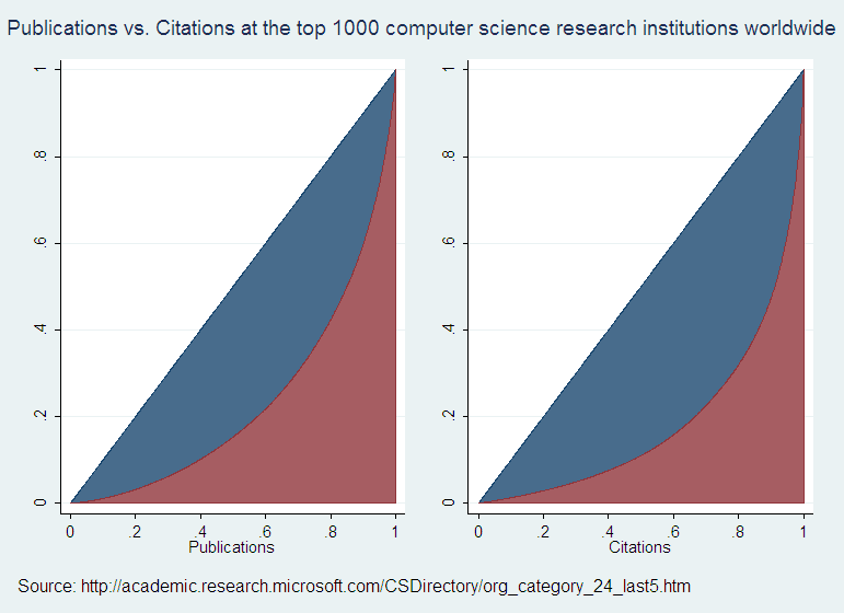
The curvature of the bottom edge of the blue areas – let’s call them sails – gives an idea of how unequally the output is distributed across the producers. The bigger the dip (and therefore the larger the blue sail) the larger the share of the total output credited to the top producers. The ratio of the sail surface to that of the triangle under the 45 degree line is the Gini coefficient: a measure of output inequality. By construction, the surface of the triangle is equal to 1/2, so the Gini coefficient is just twice the size of the blue sail. That sail can’t be larger than 1/2, so the Gini coefficient is a number between 0 and 1, which makes it a standardized measure.
If the sails are about the same size in the two graphs, then you can say that the top producers of publications aren’t any more cited than those of more humble ranking. If instead the citation sail is smaller, then you could say that more prolific institutions tend to have less-cited output. Here you can see that the citations sail is larger, which confirms that the more prolific institutions are also more cited. I figure that the respective Gini coefficients are .63 for citations and .53 for publications, by approximating the blue sails with 1000 little rectangles of width=.001 each.
Now, I don’t know what a reasonable difference between the two Gini coefficients might be, or how big they each should be in an absolute sense. If similar publications/citations data were available in other fields, we could get an idea of the observed ranges of Gini coefficients there. With data on enough fields somebody might answer my third question.